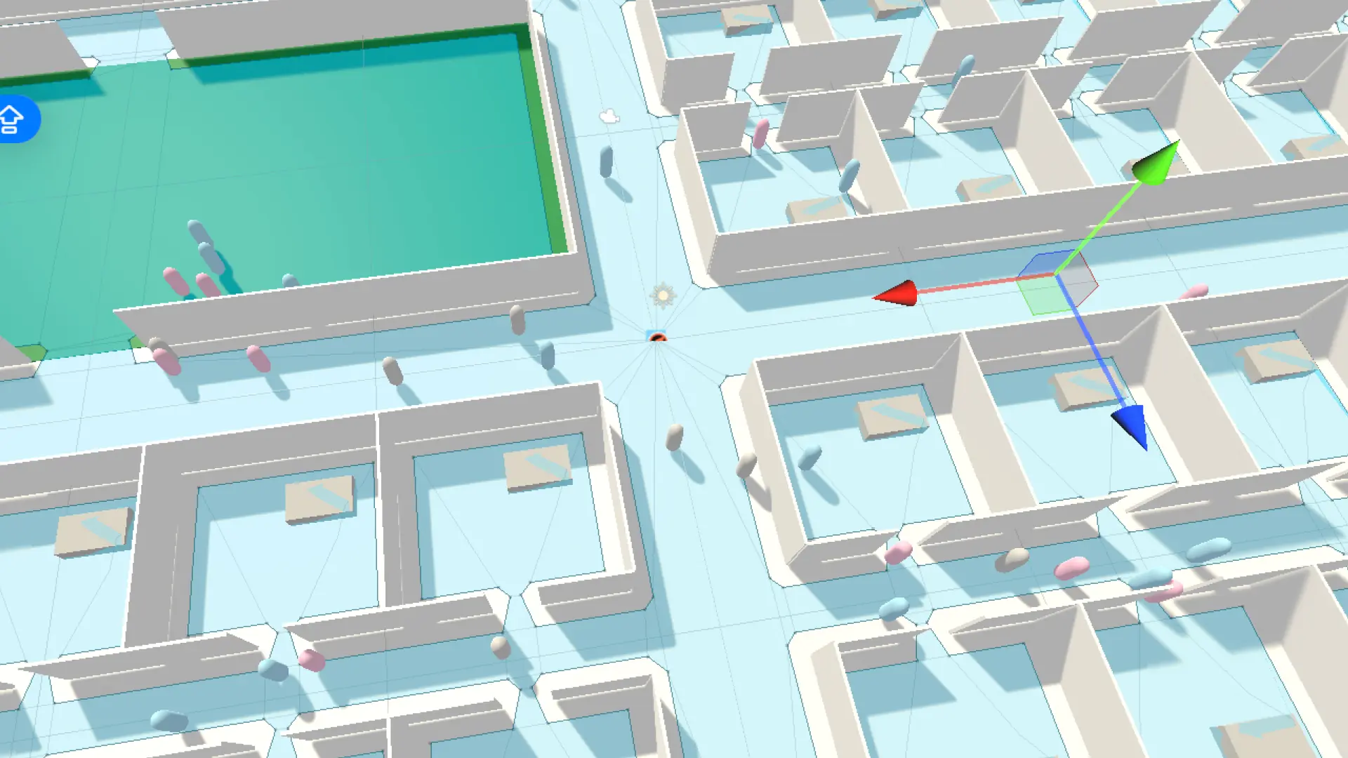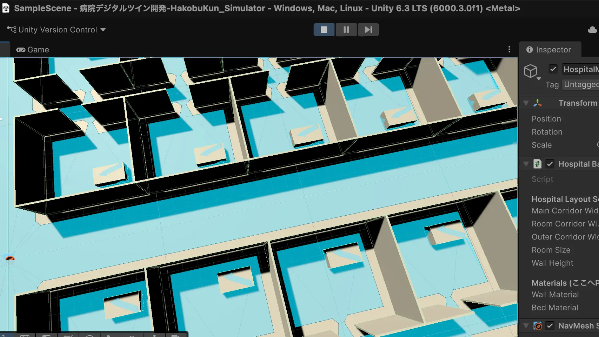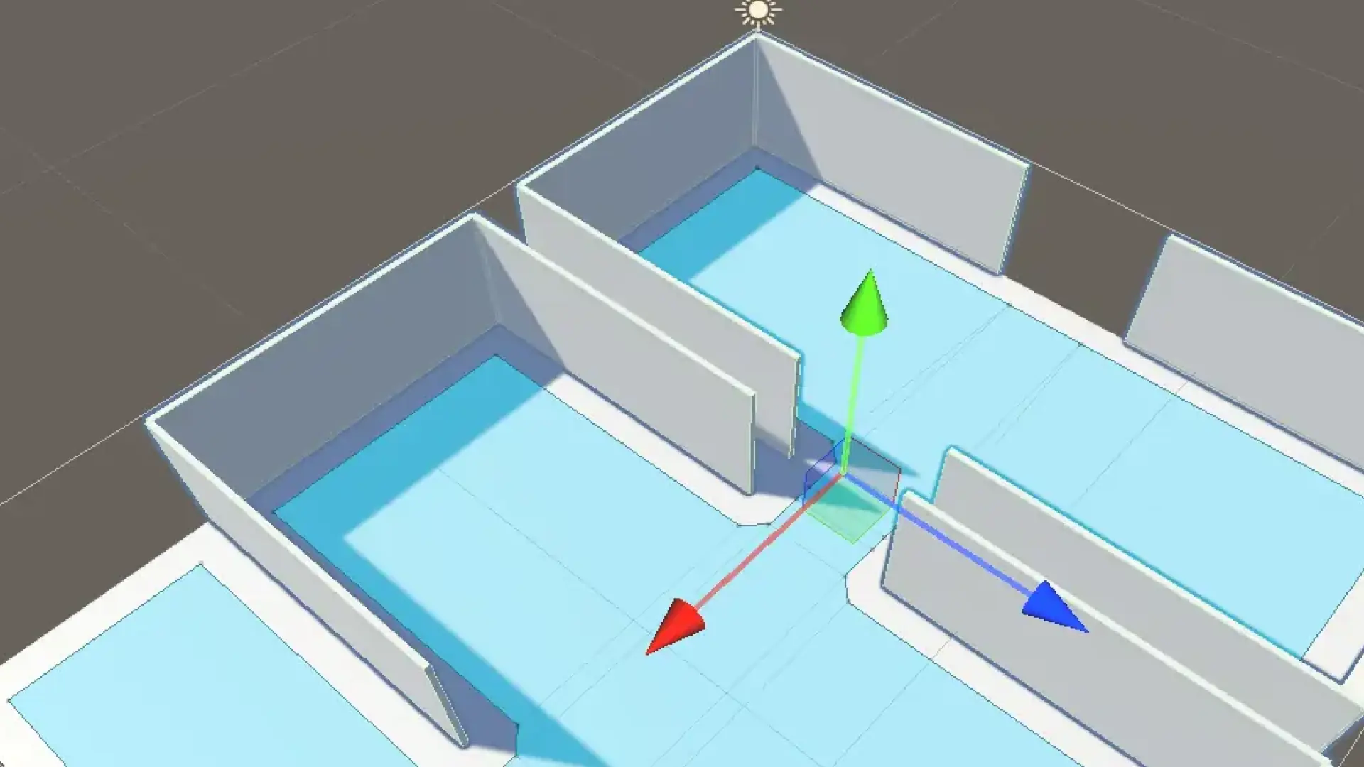

Designing the "Top Three"
■ The depth that "completeness" invites
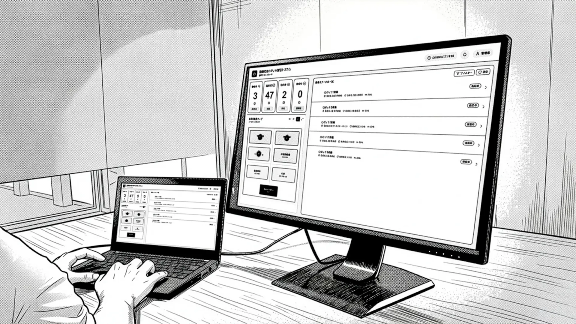
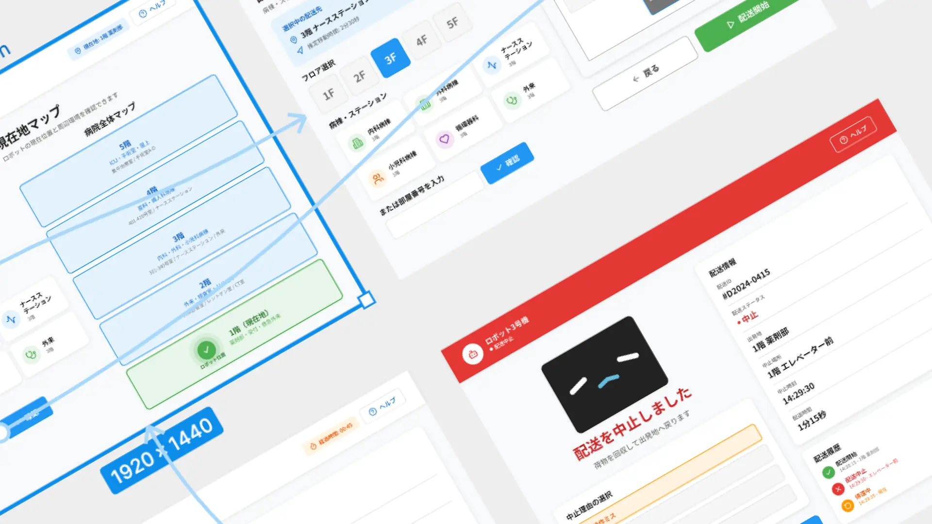
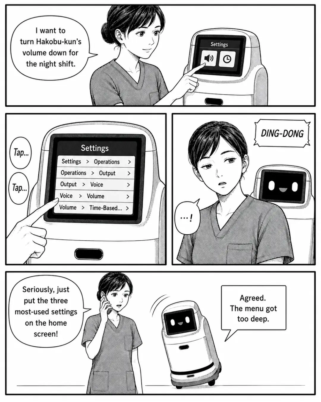
More features feel like more kindness. But in Episode 46, when Oshiro tried to lower the volume for the night shift, every tap revealed a new layer — "Settings > Operation > Output > Audio > Volume > By time of day…" A structure that stores every function without omission, however tidy, only pushes any single goal farther away.
■ The cost of "depth," exposed by an interruption
One tap short of her goal, a nurse call rang and Oshiro stepped away. When she returned, a timeout had sent her back to the very first screen. Work on the floor rarely finishes in a single breath. Deep hierarchies may hold up in calm moments, but on a floor built around interruption and resumption, they become a trap that resets you to square one every time.
■ Conclusion: the home screen's choices decide the UX
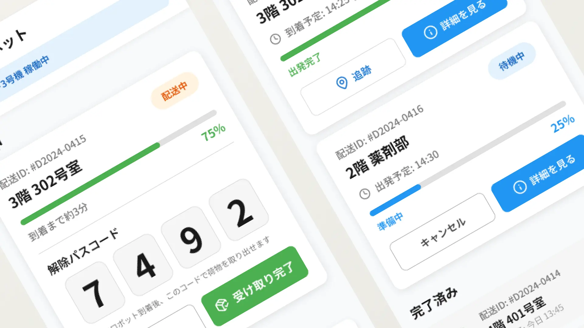
Oshiro phoned the engineer — "Just put three 'frequently used' settings on the top screen" — and Hakobukun nodded, "Agreed. Too deep." Feature completeness and instant access to what the floor touches daily are separate problems. Not what you include, but what you surface first — that act of curation is what decides the UX.